UI improvement suggestion
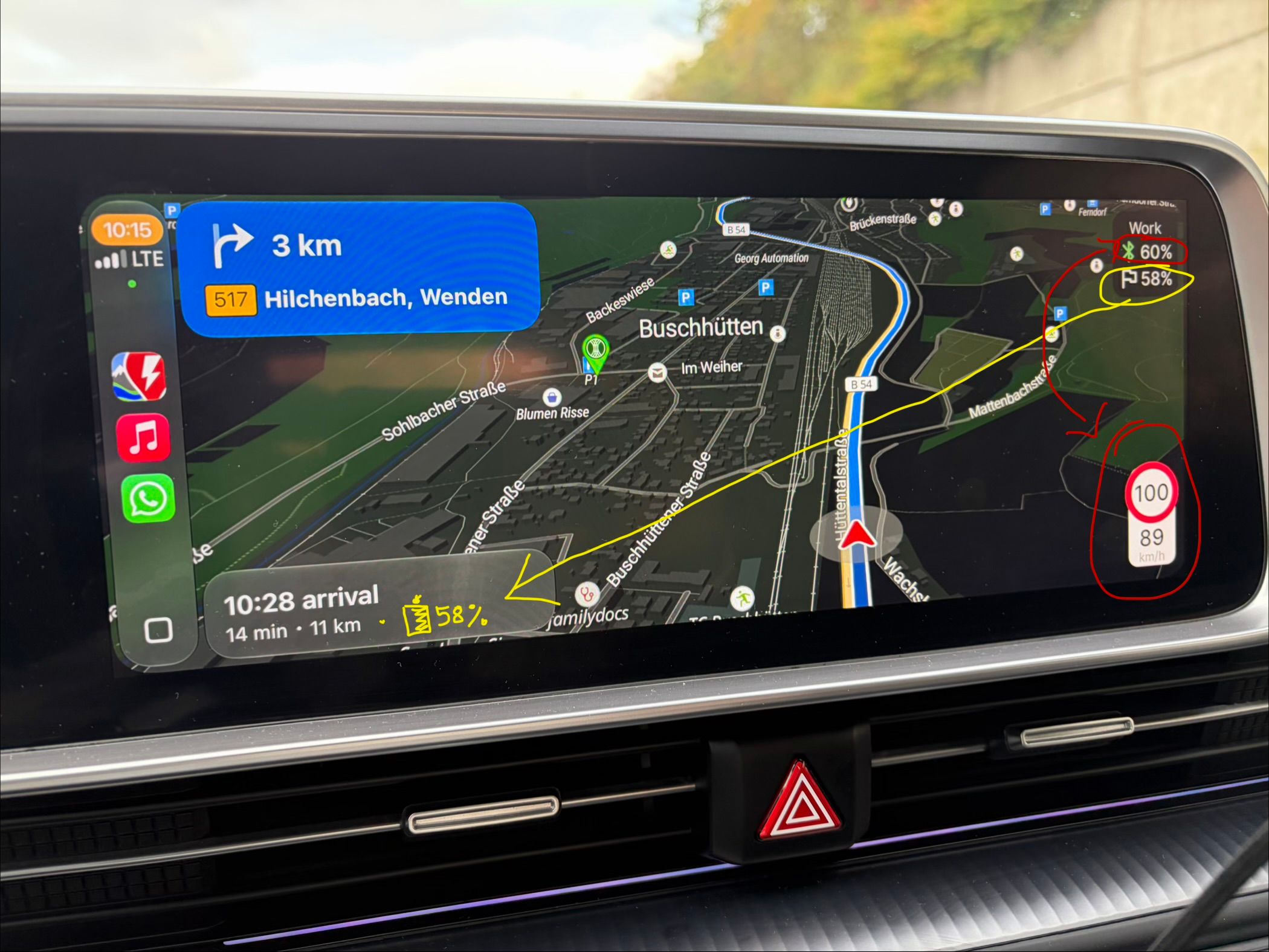
It feels more natural to have the expected battery state on arrival in the bottom left of the screen. Also the speed / speed limit should go top right or left, while the current battery % could go down and right.
Also, as others have pointed out, it would be nice to have the controls on the left for LHD vehicles as screens are getting wider and wider, which makes it hard to reach UI elements to the far right side.
Thank you!
Log in to comment and vote
No comments yet
Be the first to share your thoughts.