ABRP 8.0 - Please show the SoC graph again in driving mode!
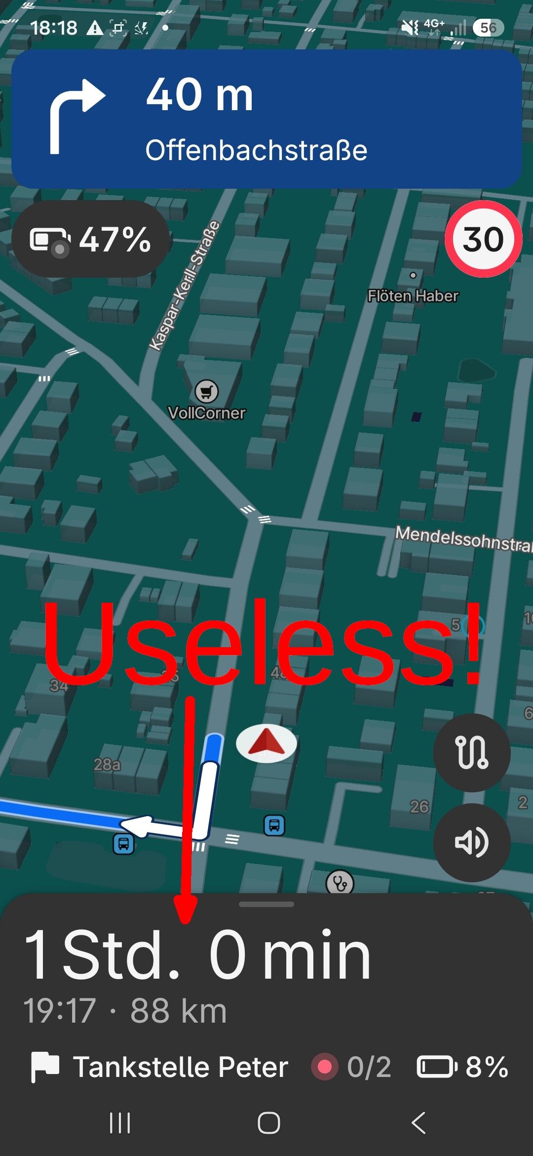
The redesigned navigation display (“Drive” mode) in ABRP 8.0 is terrible. If it stays this way, to be honest, it’s a reason for me to stop using ABRP.
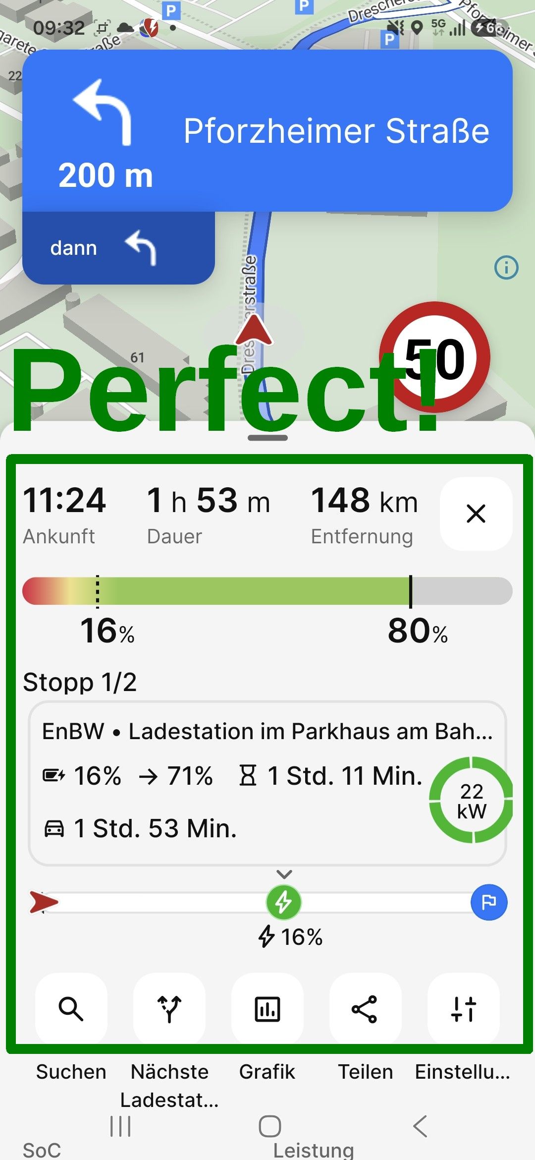
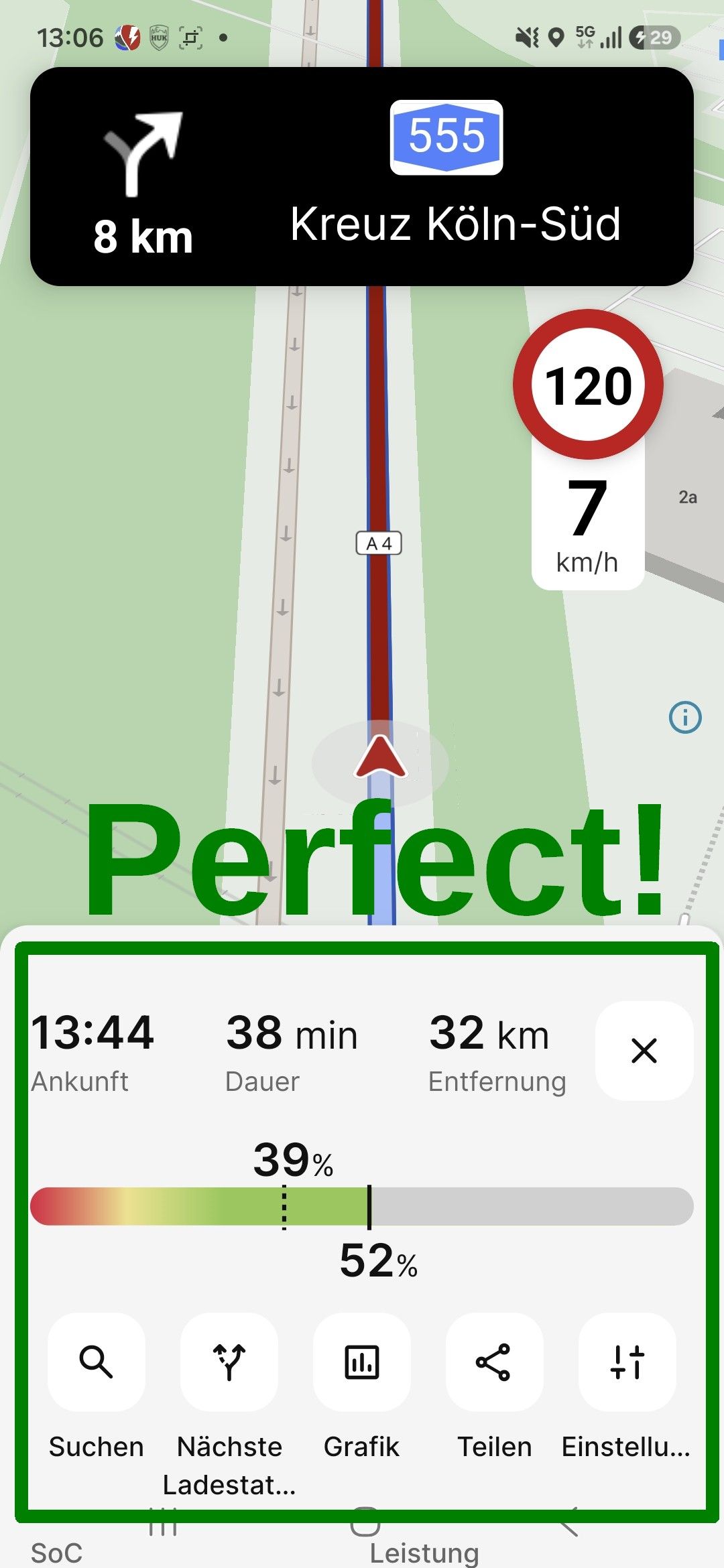
I don’t understand why the SoC bar is no longer there. The values for the current and projected SoC at the (intermediate) destination are still visible in the current version, but you can no longer grasp the situation at a glance. That used to be a unique selling point of ABRP.
Instead, the remaining travel time appears in huge font, while the arrival time and the remaining travel distance are displayed in much smaller text. Why? Here, one piece of information is given a priority that is completely arbitrary. Previously, the remaining travel time, arrival time, and remaining travel distance were all displayed in the same font size and thus given equal weight. That’s how it should be.
The current display in ABRP 8.0 is a significant step backward compared to earlier versions.
The graph is also no longer accessible.
I request the reinstatement of these earlier features, at least as an optional setting. Thank you very much.
Log in to comment and vote
Comments1
ABRP User #2858883
Nov 16
Why can’t i make this huge square go away when i driving. It is taking up a third of the screen. I know perfectly well which car i am driving, and it’s production year. But why do have to look at it when i just driving without a set goal. Please make it possible to swipe it away or a x in the corner to get rid of it. The looking glass worked so fine before and made sense when i needed to find a new destination.